CVB Village Fest Campaign
Overview
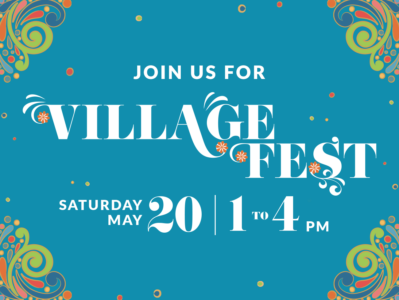
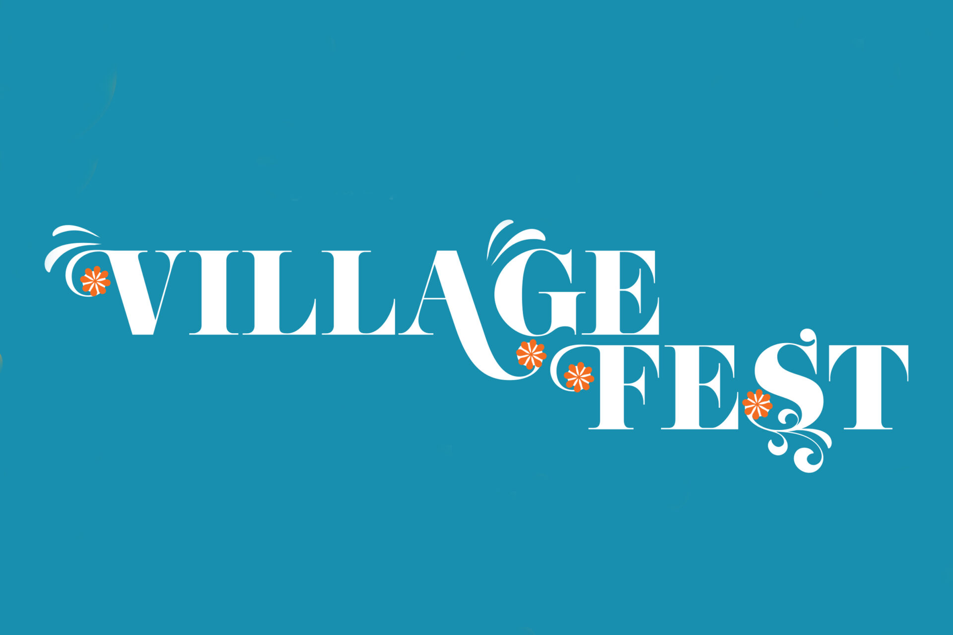
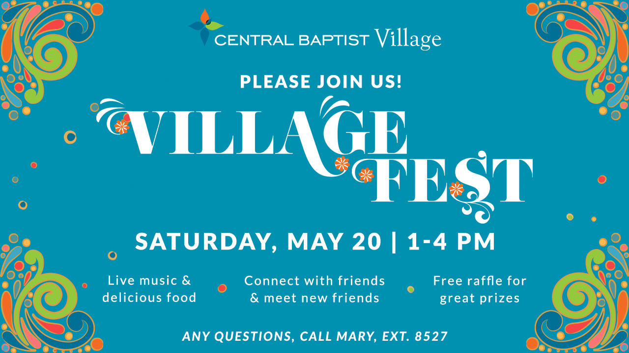
The Village Fest Spring Campaign was created to celebrate both the arrival of spring and the community’s anniversary. The event brought residents together for a full day of music, food, games, and tours—capturing the joy and connection at the heart of CBV. My role was to establish a visual identity for the campaign that would tie together all supporting materials across print and digital platforms, creating a consistent and festive look.
Spring Campaign
Print & Digital Publication Design
Community Event Campaign
Brand Identity
Client: Central Baptist Village
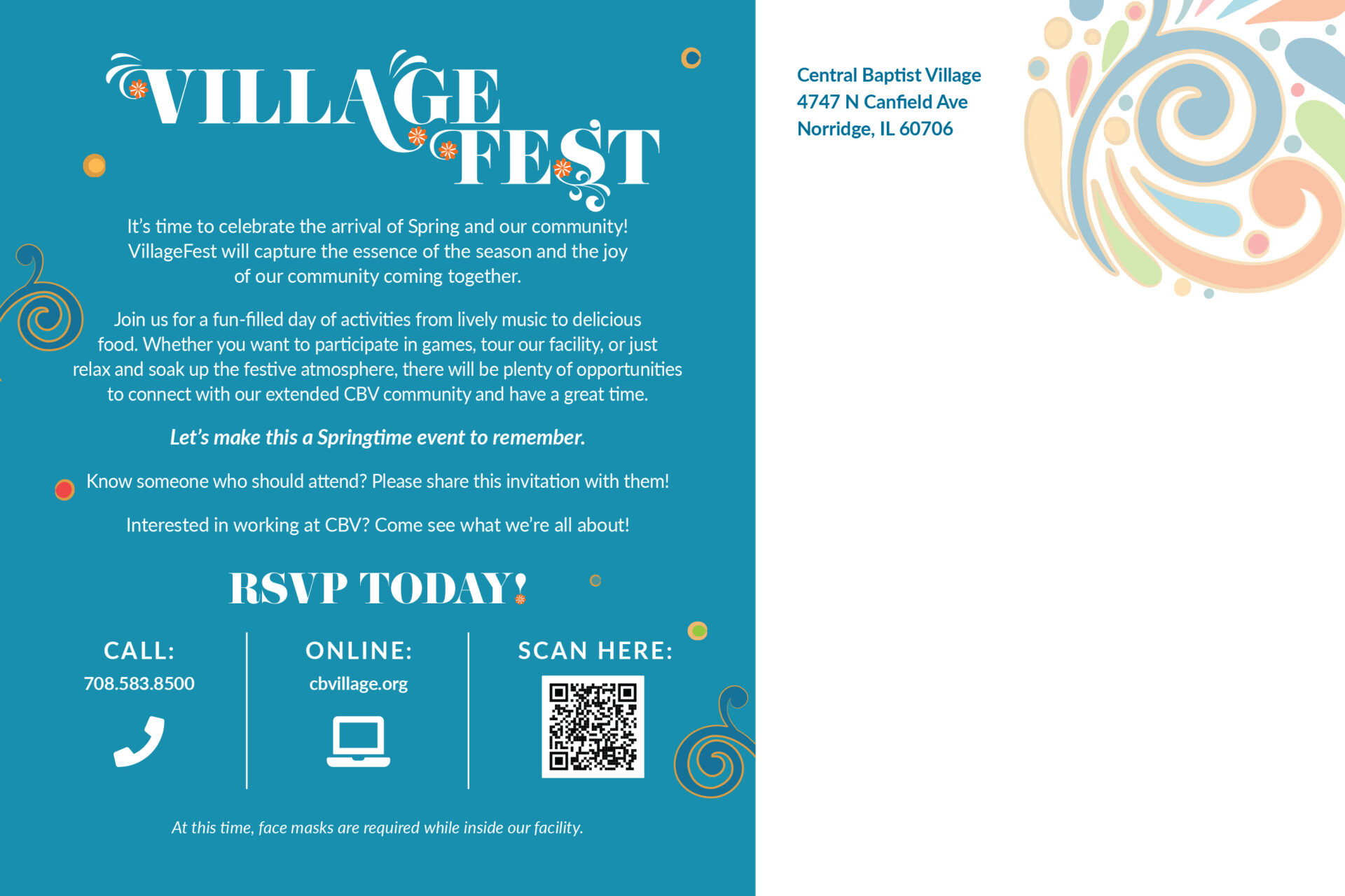
Mailer
My Role
I led the design for the campaign’s visual identity, which included:
- Designing the event logo
- Creating illustrated elements to capture a springtime, community feel
- Establishing the overall look and style for the campaign
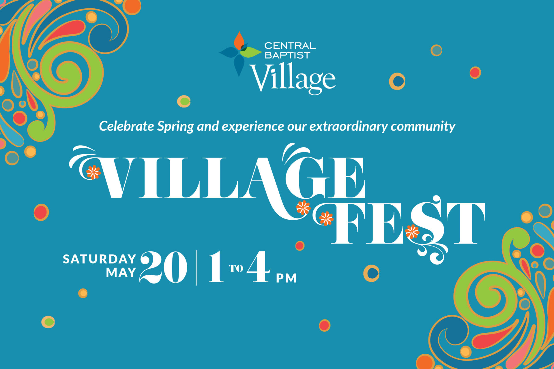
- Designing the event poster and mailer
- Building graphics for the event landing page
- Designing email marketing assets
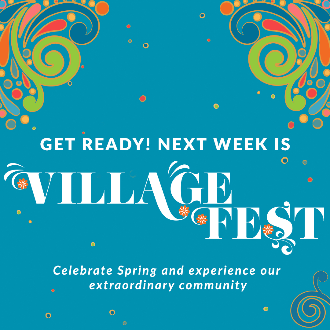
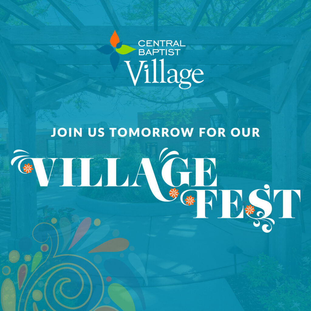
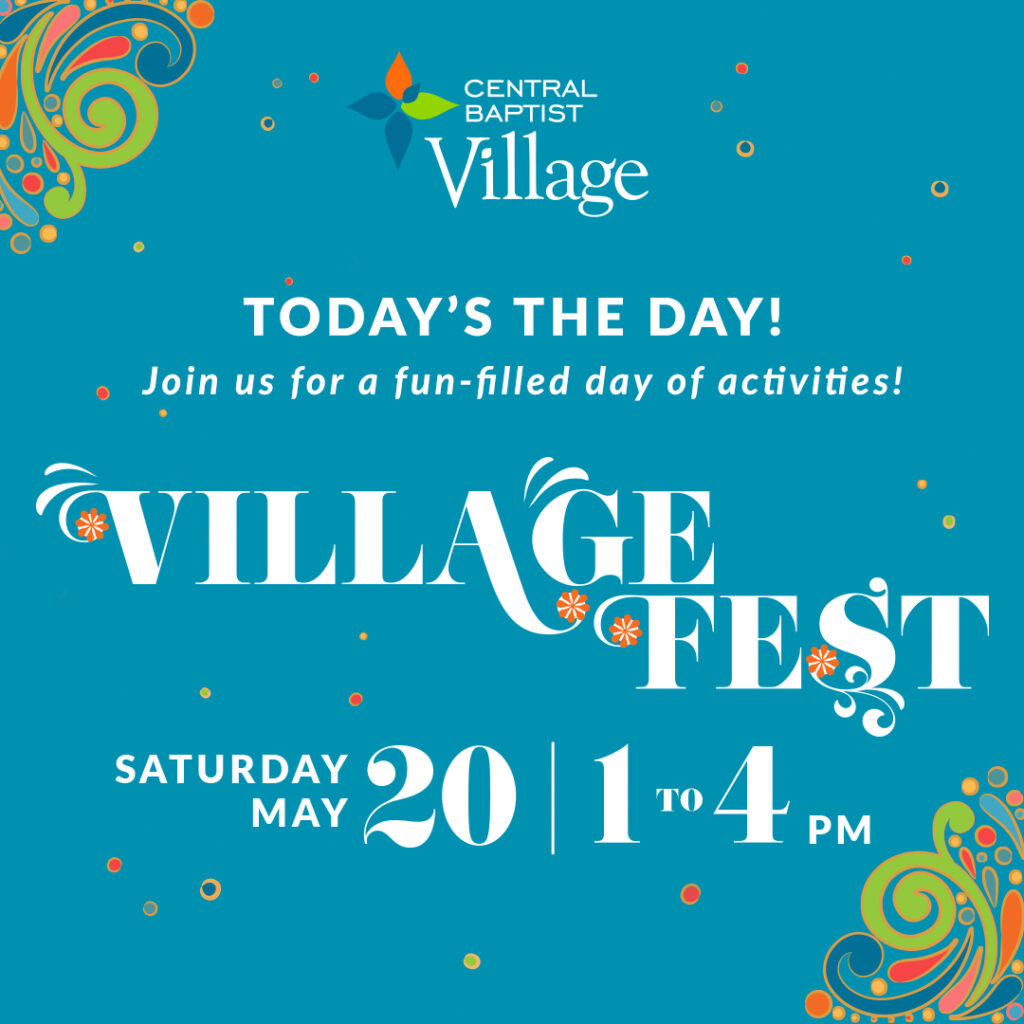
- Creating a suite of social media graphics
Social Posts
Objective
CBV wanted a cohesive campaign that would highlight the vibrancy of the season and reflect the warmth of the community. The visuals needed to feel fresh, celebratory, and approachable—drawing people in while clearly communicating event details. The identity also had to be versatile enough to work across multiple formats, from large-format posters to email graphics and social media posts.
The Result
The campaign delivered a unified, engaging presence for Village Fest, helping boost awareness and excitement for the event. The cohesive look strengthened CBV’s brand identity for community celebrations and provided a design foundation that can be adapted for future events.
Approach
The design centered on bright, cheerful colors, playful illustrated elements, and a clean layout that kept event details easy to read. The illustrated components added a playful, organic touch, while the bold logo served as the anchor for all materials. Consistency was key—every piece shared the same visual language, ensuring that whether someone saw a flyer in the mail, a post on social media, or the landing page, they instantly recognized it as part of Village Fest.
Let’s connect
If you’re looking for a graphic designer who’s organized, collaborative, and easy to work with, I’d love to hear from you. Whether you’ve got a project in mind or just want to start the conversation, reach out anytime.
Based in the Chicago Suburbs. Available for freelance and contract work.
